EV TELEMATICS · PRODUCT DEEP DIVE
A panel by panel walkthrough of how our EV dashboard reads a live battery pack, every one of its sixteen cells, the road the vehicle travels and the maintenance it will need next.

Every EV fleet eventually runs into the same wall. The vehicle is tracked, the route is known, the driver is logged in, and yet nobody can say with confidence how much life is left in the battery that paid for most of the vehicle. A diesel dashboard shows a fuel level and an odometer. An EV dashboard has a much harder job. It has to explain an electrochemical system that ages every single day, reacts to heat, remembers how it was charged, and can be quietly ruined by one weak cell hiding behind a perfectly healthy pack average.
This article walks through the Navionyx EV dashboard exactly as a fleet manager, a lender or an OEM engineer sees it. We use a live screen from a working electric commercial vehicle with a sixteen cell, 48 volt class battery pack, captured on 30 September 2026 while the vehicle was parked on NH334 near Muzaffarnagar in Uttar Pradesh. We explain what every tile means, how the numbers relate to each other, which thresholds actually matter, and how the same stream of data becomes cell level alerts, predictive maintenance, GPS history and a battery record that lenders and buyers can trust.
If you only have time for one idea, take this one: a good EV dashboard does not show you more numbers, it shows you the relationships between them. Pack voltage should agree with cell voltages. State of charge should agree with amp hours remaining. Energy used should agree with distance travelled. When those relationships hold, you can trust the vehicle. When they break, the break itself is the most valuable signal on the screen.
WHY THIS MATTERS NOW
India registered roughly 2.45 million electric vehicles in FY2026, taking EV penetration to 8.27 percent of all vehicles sold, according to Vahan retail registration data. Electric three wheelers alone crossed 830,000 units and now account for 61 percent of every three wheeler sold in the country. Cumulative EV registrations crossed roughly 86.8 lakh units by the end of FY2026.
That is millions of battery packs whose condition now decides loan risk, resale value and daily uptime. In our work with dealers and lenders, the battery pack typically accounts for 35 to 45 percent of a used EV’s total value. Nobody can afford to manage that asset blind.
KEY TAKEAWAYS
- ✓ The live header answers “is this vehicle alive, moving and reporting” in under two seconds.
- ✓ The State of Charge card tells you what the vehicle can do today. The Battery Health card tells you what the pack can do over the next few years.
- ✓ Sixteen individual cell cards expose imbalance and hot spots long before the pack average moves.
- ✓ GPS, trip, SOC and mileage history tie every percent of charge to a place, a route and a time of day.
- ✓ Cell level alerts and predictive maintenance turn all of this into a short to do list instead of a wall of numbers.
- ✓ Sustainability tiles convert the same data into CO2, fuel and cost savings you can report to management, lenders and ESG teams.
IN THIS ARTICLE
- Why a GPS tracker is not an EV dashboard
- The live header strip: identity, status and data freshness
- State of Charge: what the vehicle can do today
- Battery Health: what the pack can do over years
- Cell level monitoring: sixteen batteries inside one battery
- Temperature intelligence: ambient, pack and hottest cell
- Alerts and maintenance notifications, down to the individual cell
- Predictive maintenance: from alerts to forecasts
- GPS dashboard, live location and route history
- SOC history and mileage history
- Sustainability and impact reporting
- Who uses which part of the dashboard
- A five minute daily routine for fleet managers
- Frequently asked questions
1. Why a GPS Tracker Is Not an EV Dashboard
A GPS tracker answers one question very well: where is the vehicle? For a petrol or diesel fleet that covers most of what an operations team needs, because the engine is a relatively stable machine and fuel is easy to measure. For an EV fleet, location is only the first of four questions, and it is the least expensive one to get wrong.
The other three questions are the ones that decide profitability. How much usable energy is on board right now? How healthy is the pack that stores that energy? And what is going to fail next, and when? A vehicle that shows 60 percent charge yesterday is not the same vehicle that shows 60 percent charge today, because cell balance, pack temperature and recent driving all shift how much of that energy is actually usable on the road.
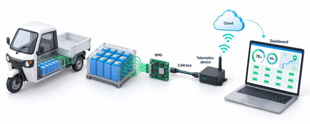
This is why the Navionyx platform reads data directly from the vehicle’s CAN bus and Battery Management System through an in vehicle IoT device, rather than inferring battery condition from GPS movement alone. The BMS already knows the voltage of every cell, the temperature at every sensor, the current flowing in and out, and the charge counters it uses to estimate state of charge. Our job is to capture that data reliably, store it as a continuous history, and turn it into decisions. The hardware is OEM agnostic and works across the major electric two wheeler, three wheeler and commercial EV platforms operating in India, and the same device that reads the battery also provides the GPS feed, so there is one installation, one data stream and one timeline.
How the screen is organised
The vehicle detail page is laid out so that the most urgent information sits at the top and the slowest moving information sits at the bottom. Reading from top to bottom, you move from “right now” to “this year”:
- Live header strip: identity, movement status, speed, current, pack voltage, ambient temperature, network signal and data freshness, with Map and Relay controls.
- Three core cards: State of Charge, Battery Health and Location, side by side.
- Battery Cells and Alerts: the full sixteen cell grid with voltage and temperature views, next to the live alert feed for the vehicle.
- Sustainability and Impact: CO2 avoided, fuel avoided, cost saved and a cumulative twelve month chart, with lifetime and monthly views and a choice of petrol, diesel or CNG as the comparison fuel.
- SOC History: today’s state of charge curve plus a report table with time, duration, SOC, delta SOC, distance and mileage.
The left navigation tells you something about who the platform is built for. Alongside Home and Vehicles you will see Users, Distributors, Orders, Sales, Branding, Pending, Ext Push and Districts, plus a device counter showing how many devices are active against the account’s allocation. This is a multi tier platform: an OEM, an NBFC or a white label partner can run their own branded instance, manage distributors and districts, and push data to their own systems, while end fleet customers see only their own vehicles.
2. The Live Header Strip: Identity, Status and Data Freshness
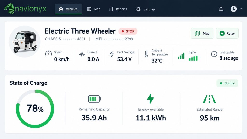
The header strip is designed to be read in a single glance. Before you look at anything else on the page, it tells you which vehicle you are looking at, whether it is moving, whether energy is flowing, and whether the data you are about to trust is fresh.
Identity and status
The vehicle is identified by its chassis number, with the IMEI of the installed telematics device shown underneath. Keeping both visible matters more than it seems. When a device is moved between vehicles, or when a service team swaps a unit during repair, the pairing between chassis and IMEI is the first thing that needs to be verified. The status pill next to the name, STOP in our example, shows the current movement state so you can immediately tell a parked vehicle from a moving one or an offline one.
Speed, current and pack voltage
Speed is shown in km/h. Current, in amperes, tells you the direction of energy flow. In our example the vehicle is stopped and the current reads 0.0 A, which is exactly what a parked, non charging vehicle should show. Current flowing into the pack while the vehicle is stopped means it is charging. A steady outflow while the vehicle is stopped and switched off is a different story: it can point to a parasitic load, an auxiliary device left on, or a wiring fault, and it is worth a closer look because it drains the pack while nobody is watching.
Pack voltage reads 53.3 V. Here is the first relationship check that a good dashboard makes easy. The pack has sixteen cells in series, and 53.3 V divided by sixteen is about 3.33 V per cell. Scroll down to the cell grid and you will find fifteen cells at 3.330 V and one at 3.340 V. The pack figure and the cell figures agree. If they did not, you would suspect a sensing fault, a loose connection or a BMS reporting issue before you suspected the cells themselves. A resting voltage around 3.3 V per cell is also typical of lithium iron phosphate (LFP) chemistry, which dominates commercial EV packs in India because of its long cycle life and thermal stability.
Ambient temperature, signal and last update
Ambient temperature, 32.0 °C in our example, gives you the context for every battery temperature further down the page. A pack at 38 °C on a 37 °C afternoon is normal. A pack at 38 °C on a 22 °C morning is not.
Signal quality, shown here as Good, and the last update time, 33 seconds ago, together answer the question every operations team should ask before acting on any number: is this live? A vehicle that last reported three hours ago with a weak signal may simply be in a basement parking lot. A vehicle that last reported three hours ago with a good signal on its previous ping may have lost power to the device. The dashboard makes this distinction visible instead of silently showing you stale data as if it were current.
Map and Relay controls
The Map button opens the full live map and route history for the vehicle. The Relay button is the remote immobilisation control, used mainly by lenders and fleet owners for recovery and security. Relay actions are permission controlled, logged, and should always be used according to a clear written policy and only when the vehicle is stationary. For an NBFC financing thousands of vehicles, this single control changes the economics of recovery, but it is also the control that deserves the most governance.
3. State of Charge: What the Vehicle Can Do Today
The State of Charge card is the fuel gauge of the EV dashboard, but it carries far more information than a fuel gauge ever did. The large number, 60 percent in our example, is the BMS estimate of how full the pack is. The small chip beside the title shows the change in state of charge so far today, which instantly tells you whether the vehicle has been working, charging or sitting idle since midnight.
Amp hours remaining against rated capacity
Below the headline figure, a progress bar reads 137.6 Ah of 230.0 Ah. This is the remaining charge in amp hours against the pack’s rated capacity. Divide one by the other and you get 59.8 percent, which rounds to the 60 percent shown above it. Again the numbers agree, and that agreement is what lets you trust the headline. Showing amp hours alongside the percentage also helps technicians, who think in amp hours, and finance teams, who need to translate energy into rupees.
Range remaining and distance to empty
Range remaining and distance to empty both read 120 km in our example. Range is not a fixed property of the battery. It is calculated from the energy on board and the vehicle’s own recent consumption, so the same state of charge will give a different range for a vehicle that has been climbing flyovers with a full load than for one cruising empty on a flat road. When a dispatcher is deciding whether a vehicle can complete a route, this is the figure they should use, not a generic range printed in a brochure. If the range estimate starts falling faster than the state of charge, the vehicle’s consumption has changed, and that change is itself worth investigating.
Energy consumed, last full charge and efficiency
The bottom row of the card shows energy consumed in kWh, the timestamp of the last full charge, and efficiency in km/kWh. Efficiency is the true mileage metric for an EV. It lets you compare vehicles on the same route, drivers on the same vehicle, and the same vehicle across months. A vehicle whose km/kWh drops steadily on an unchanged route is telling you something about its battery, its tyres, its brakes or its driver.
The last full charge field deserves special attention, and it is one of the most underrated tiles on the screen. In our example it reads 27 May 2026, which is four months before the screen was captured. For an LFP pack, that is worth acting on. LFP cells have a very flat voltage curve through the middle of their charge range, which makes it hard for the BMS to estimate state of charge purely from voltage. Most BMS designs rely on counting current in and out, and that count slowly drifts. A periodic full charge gives the BMS a known reference point to recalibrate against, and it is also when most packs perform passive cell balancing at the top of charge. A fleet that only ever charges to 80 or 90 percent to protect the battery can end up with a less accurate state of charge estimate and slowly drifting cells. The practical answer for most LFP fleets is a scheduled full charge at a regular interval set with the OEM’s guidance, and the last full charge tile tells you at a glance which vehicles have missed it.
HOW TO READ THE STATE OF CHARGE CARD IN TEN SECONDS
- Check that the percentage and the amp hour bar tell the same story.
- Compare range remaining with the distance of today’s planned route, plus a safety margin.
- Look at the change today chip to see whether the vehicle has worked, charged or rested.
- Note the last full charge date. If it is weeks old, schedule a full charge so the BMS can recalibrate and balance.
4. Battery Health: What the Pack Can Do Over Years
If State of Charge is the fuel gauge, Battery Health is the engine condition report. It moves from “what can this vehicle do today” to “what can this pack still deliver over its working life”, which is the question that drives replacement budgets, lease terms, loan to value ratios and resale prices.
State of Health
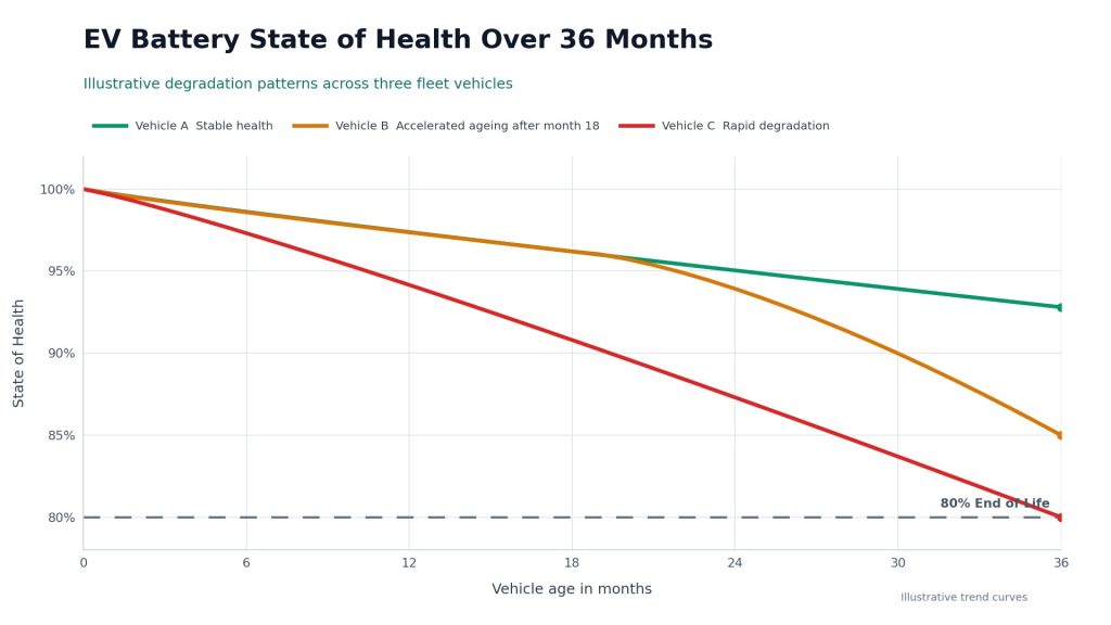
The large ring shows State of Health, 100 percent in our example. State of Health is the percentage of the pack’s original capacity that is still available. A new pack starts at 100 percent and declines as it ages. In the battery industry, end of life for automotive use is commonly defined when capacity falls to somewhere between 70 and 80 percent of the original, at which point the pack is usually retired from vehicle duty and considered for second life use such as stationary storage.
A reading of 100 percent after 190 charge cycles is perfectly normal for a young LFP pack. The single number is not where the insight lives. The insight lives in the slope. Two vehicles can both read 94 percent today, but if one lost those six points over three years and the other lost them over eight months, they are very different assets. That is why the Navionyx platform stores every reading as a continuous history rather than a single snapshot, and why we always recommend reading SoH as a trend line.
Charge cycles, capacity and pack temperature
Next to the ring, the card lists charge cycles, current capacity, rated capacity and average pack temperature. Charge cycles, 190 in our example, count how intensively the pack has been used, independently of the odometer. It helps to understand the difference between charging sessions and equivalent full cycles. Plugging in at 40 percent and charging to 90 percent is one session but only half of a full cycle. Both numbers are useful: sessions tell you about charging habits, while equivalent full cycles tell you about wear. We explore this in depth in our guide on how charge cycle history predicts EV battery life, including why the pattern of cycles matters as much as the count.
Rated capacity, 230.0 Ah here, is the factory figure the pack was sold with. Capacity now is what the BMS estimates the pack can hold today. The gap between the two, expressed as a percentage, is effectively your State of Health, so these tiles let an engineer verify the ring rather than simply accept it.
Average pack temperature, 32.0 °C here, matches the ambient temperature in the header, which is exactly what you expect from a pack that has been parked for a while. The interesting readings come when the vehicle is working or charging, and we cover those in the temperature section below.
Total distance and total energy
The bottom of the card shows lifetime totals: 6,105.0 km of total distance in our example, along with total energy. These two totals feed the lifetime efficiency figure and the sustainability calculations later on the page. They also form the backbone of a battery’s service record. When the vehicle is resold, refinanced or returned at the end of a lease, the combination of total distance, total energy, cycle history and SoH trend is far more convincing than an odometer reading and a verbal promise that “the battery is fine”.
5. Cell Level Monitoring: Sixteen Batteries Inside One Battery
This is the panel that separates a real EV battery dashboard from a battery percentage on a map. A battery pack is not one battery. It is a string of individual cells, sixteen in our example, connected in series. Every cell carries the same current, but no two cells are ever perfectly identical. They differ slightly in capacity, internal resistance and temperature, and those small differences grow with age.
Because the cells are in series, the pack can only discharge until its weakest cell reaches its lower voltage limit, and it can only charge until its fullest cell reaches its upper limit. The BMS protects the pack by stopping discharge or charge at those points, even if the other fifteen cells still have room. In practice this means one weak cell can reduce the usable capacity of the entire pack, and the pack level SoH figure may not show it until the problem is well advanced. As we explain in why EV battery health is more than SoH, the single headline percentage cannot tell you which cell is creating the imbalance or why.
The summary row
Above the cell grid, a summary row shows six numbers that together describe the pack’s internal consistency:
| Metric | Example value | What it tells you |
|---|---|---|
| Pack dV | 10 mV | The spread between the highest and lowest cell voltage. The single most important consistency metric. |
| Min cell | 3.330 V | The weakest cell at this moment, which limits how far the pack can discharge. |
| Max cell | 3.340 V | The fullest cell at this moment, which limits how far the pack can charge. |
| Avg temp | 32.0 °C | The mean of all cell temperature readings. |
| Hottest | 32.0 °C | The highest single temperature reading, which is what drives thermal alerts. |
| Balance | Balanced | A plain language verdict based on the spread, so non engineers do not need to interpret millivolts. |
The cell grid
Each of the sixteen cards shows one cell’s voltage, its temperature and a bar that visualises where that cell sits in its range. In our example, cells 01 through 15 all read 3.330 V and cell 16 reads 3.340 V, with every cell at 32.0 °C. That is a textbook healthy, balanced pack at rest. The Voltage and Temperature toggle switches the grid between the two views, and the Cell Voltage and Cell Temperature buttons open time series charts that plot every cell over time, so you can see not just where each cell is now but how it has behaved across charging sessions and working shifts.
When to look at the spread
Here is a practical insight from reading thousands of LFP packs: the spread at mid charge can look reassuring even when the cells are drifting apart. Because the LFP voltage curve is so flat in the middle, cells holding noticeably different amounts of charge can show almost the same voltage at 50 or 60 percent. The differences reveal themselves at the ends of the curve, near full charge and near empty, and under load, when a cell with higher internal resistance sags further than its neighbours. That is why the time series charts matter. The most useful view is often the cell voltage chart around the end of a charging session and during the heaviest part of a working shift.
As a rough rule of thumb for LFP packs at rest in the middle of their charge range, a spread of a few tens of millivolts or less is typically healthy. A spread that keeps widening week after week, or that climbs past roughly 50 mV at rest, deserves attention. These are starting points rather than universal rules. Alert thresholds on the Navionyx platform can be set per chemistry, per OEM and per vehicle model, because a 60 V two wheeler pack and a large commercial pack do not behave the same way.
Common cell patterns and what they usually mean
| Pattern on the dashboard | What it usually means | Sensible next step |
|---|---|---|
| One cell is always the lowest under load but recovers when the vehicle stops | That cell has higher internal resistance than its neighbours, often an early sign of ageing | Track the trend; plan an inspection before it becomes the limiting cell |
| One cell reaches the upper limit first during every charge | A state of charge imbalance between cells | Allow a full charge so balancing can work; check the balancing circuit if it persists |
| One cell runs several degrees hotter than the rest | A poor busbar or terminal connection, a cell defect, or uneven cooling | Inspect connections promptly; heat at a single point should never be ignored |
| The spread grows steadily over weeks | Progressive divergence between cells | Raise a predictive maintenance ticket and schedule a service window |
| The spread spikes only during hard acceleration or heavy loads | Resistance differences exposed by high current, sometimes amplified by driving style | Correlate with the driver behaviour data for that vehicle |
| One cell suddenly jumps or drops while others stay steady | More often a sensing wire or connector fault than a real cell change | Verify the sensor and wiring before replacing any cell |
SCREENSHOT SLOT · [SCREENSHOT 2]
Instruction: Crop the full Battery Cells panel showing the summary row (Pack dV, Min cell, Max cell, Avg temp, Hottest, Balance) and all sixteen cell cards. Suggested alt text: Navionyx EV dashboard Battery Cells panel showing sixteen individual cell voltages and temperatures with a Balanced status.

6. Temperature Intelligence: Ambient, Pack and Hottest Cell
Temperature is the silent partner of every battery decision in India. Our summers regularly push ambient temperatures past 40 °C across large parts of the country, vehicles park in open sun, and commercial EVs often go straight from a long shift to a charger. The dashboard gives you three temperatures to reason with: ambient in the header, average pack temperature in the Battery Health card, and the hottest cell in the cell summary row.
Why three? Because each answers a different question. Ambient tells you what the environment is doing. Average pack temperature tells you what the battery as a whole is experiencing. The hottest cell tells you whether any single point in the pack is under more stress than the rest. The most useful derived signal is the gap between them. A pack that sits a couple of degrees above ambient during a shift is normal. A pack whose hottest cell runs well above the pack average, or a pack that climbs far above ambient during charging, is showing you where damage is being done.
Published battery research consistently shows that lithium ion capacity fade depends strongly on temperature, following a rough V shape. Cells age more slowly around moderate temperatures near 25 °C. They age faster at high temperatures around 40 °C, mainly because of accelerated growth of the solid electrolyte interphase layer that consumes lithium, and they also age faster in the cold, mainly because of lithium plating during charging. In one detailed ageing study, capacity fade was most severe at 40 °C, followed by 10 °C, with 25 °C the gentlest. For Indian fleets, the hot side of that V is the one that matters most of the year.
PRACTICAL TEMPERATURE RULES WE SEE WORK IN INDIAN FLEETS
- Let a hot pack rest before plugging it in after a long afternoon shift, rather than charging immediately.
- Where possible, schedule charging for cooler hours, such as late night or early morning.
- Avoid leaving vehicles parked at full charge in direct afternoon sun.
- Set alerts on both the hottest cell temperature and the gap between the hottest cell and the pack average.
- Compare temperature behaviour across vehicles on the same route. The outlier is usually the one with a connection or cooling problem.
The Temperature toggle on the cell grid turns the sixteen cards into a live heat map of the pack, and the Cell Temperature chart plots each sensor over time. When a thermal alert fires, these two views let a technician see immediately whether the whole pack warmed up together, which usually points to environment or usage, or whether one location heated on its own, which usually points to a physical fault.
7. Alerts and Maintenance Notifications, Down to the Individual Cell
Dashboards are for looking. Alerts are for acting. Nobody can watch sixteen cells on hundreds of vehicles all day, so the Alerts panel sits right beside the cell grid and shows every active and recent alert for the vehicle. In our example it reads “No alerts available for this vehicle”, which is exactly what a healthy, balanced, parked vehicle should show. An empty alert panel is not a missing feature. It is good news that you can verify in one glance.
Navionyx alerts are built on the same principle as the rest of the dashboard: each alert should tell you which vehicle, which component, what value, against which threshold, at what time and at what location, so that the person receiving it can decide what to do without opening five screens. Alerts fall into five broad families.
Battery and charging alerts
- Low state of charge: warns before a vehicle runs short on a route, using the vehicle’s own consumption rather than a generic figure.
- Deep discharge: flags when a pack is run down below a safe floor before charging, set at 10 percent SoC by default for most commercial packs and adjustable per chemistry. Repeated deep discharge adds stress at the bottom of every cycle.
- High pack temperature: fires when the pack crosses a thermal threshold while driving, parked or charging.
- Charging not started: catches the vehicle that was plugged in at night but never actually began charging, before it misses the morning shift.
- Unusual discharge rate: highlights energy leaving the pack faster than the vehicle’s normal pattern for similar trips.
Cell level alerts
- Cell overvoltage and undervoltage: a specific cell crossing its upper or lower limit, named by cell number.
- Cell imbalance: the spread between the highest and lowest cell crossing the configured threshold, or growing faster than normal.
- Cell overtemperature: a specific sensor running hot, with the cell number, value and time.
- Cell temperature gap: one cell running hotter than the pack average by more than the configured margin, even if no absolute limit has been crossed yet.
Cell level alerts are where the value of cell visibility turns into money. Knowing that “the battery has a problem” sends a vehicle to the workshop for diagnosis. Knowing that “cell 11 has run 4 °C above the pack average for the last nine charging sessions” sends a technician straight to the right module with the right tools.
Vehicle, device and data alerts
- Offline or no data: the device has stopped reporting, with the last known location preserved.
- Weak signal or GPS fix lost: helps separate a genuine problem from a vehicle parked in a basement.
- Power disconnect and tamper: the device or its power supply has been interfered with.
- Ignition and movement events: including movement outside permitted hours.
Location and usage alerts
- Geofence entry and exit: for depots, customer sites, permitted operating zones and recovery watchlists.
- Overspeed and harsh driving: which matter for safety and, as we will see, for battery life.
- Prolonged idle: vehicles that are not earning when they should be.
Maintenance alerts
- Service due: based on distance, days in service or both.
- SoH threshold: when State of Health drops below a level you define for inspection, warranty review or lease reassessment.
- Cycle milestones: when a pack reaches a charge cycle count that your OEM or maintenance plan ties to a check.
Alerts reach people through the dashboard and the mobile app, and they can also be pushed into other systems. The Ext Push module in the left navigation sends alerts and daily vehicle aggregates to external endpoints such as a lender’s loan management system or a fleet operator’s ERP, using signed payloads so the receiving system can verify that the data genuinely came from the platform. For an NBFC, that means a geofence breach or a battery health drop can appear in the same loan account view as the EMI schedule, without anyone logging into a separate dashboard.
8. Predictive Maintenance: From Alerts to Forecasts
An alert tells you that a line has been crossed. Predictive maintenance tells you which line is about to be crossed, and roughly when. The difference is the difference between a breakdown on the road and a planned thirty minute visit to the workshop on a quiet afternoon.
The foundation of predictive maintenance is not a clever algorithm. It is a clean, continuous history. Because the Navionyx device records every cell voltage, every temperature and every charging session from the day it is installed, each vehicle builds up its own baseline of “normal”. Predictive models then look for slow changes against that baseline that no single reading would reveal. The signals we find most useful in commercial EV fleets are:
- SoH slope: how many points of State of Health the pack loses per hundred cycles, compared with similar packs.
- Cell spread trend: whether the gap between the highest and lowest cell is widening, and which cell is responsible.
- Thermal drift: whether the pack or a single cell runs hotter than it used to under comparable load and ambient conditions.
- Efficiency drift: whether km/kWh on an unchanged route is falling month over month.
- Charging behaviour: how often the vehicle is deep discharged, how often it is charged in heat, and whether charging sessions are taking longer than they used to.
- Fault code recurrence: BMS warnings that clear themselves but keep coming back.
How the workflow runs
STEP 1 · BASELINE
The first weeks after installation establish each vehicle’s own normal: typical cell spread, typical temperature rise per kilometre and per charging session, typical efficiency on its regular routes.
STEP 2 · COMPARE
Every new reading is compared against the vehicle’s own history and against peers of the same model on similar routes. A vehicle can look fine on its own and still stand out badly against its siblings.
STEP 3 · SCORE
Signals are combined into a maintenance risk level and a suggested inspection window, so the workshop sees a ranked list instead of raw data.
STEP 4 · ACT
The inspection is scheduled into a low utilisation slot, and the technician arrives knowing which module, which cell or which connection to check first.
STEP 5 · VERIFY
After service, the dashboard confirms whether cell spread and temperatures have returned to baseline. If they have not, the ticket stays open.
ILLUSTRATIVE EXAMPLE
Imagine a forty vehicle three wheeler fleet where every pack reads above 95 percent SoH. On a pack level report, the fleet looks identical. On the cell level history, one vehicle shows its cell 9 finishing each charge slightly later than the others, and the gap has grown a little every week for six weeks. Nothing has crossed an alert threshold yet. A predictive ticket sends that vehicle for a connection check during a quiet afternoon. A loose busbar is tightened, the spread returns to baseline, and a problem that could have ended in a stranded vehicle, a customer complaint and an expensive module replacement ends as a short, planned visit.
The cost of not doing this is higher than most operators assume, especially in leased and financed fleets where the battery’s condition at handback decides who pays for the degradation. We break down those numbers in the hidden cost of a bad battery in a leased EV fleet.

9. GPS Dashboard, Live Location and Route History
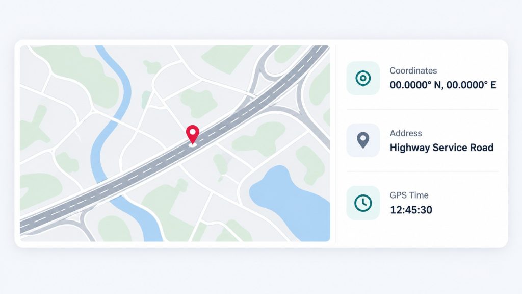
The Location card completes the top row of the vehicle page. It shows a live map with the vehicle’s pin, the raw coordinates (29.48995, 77.74280 in our example), the resolved address (NH334, Muzaffarnagar, Uttar Pradesh, 251001), and the GPS timestamp, here 30 September 2026 at 01:53 PM. The label in the corner, GPS / live, confirms that this is a live position rather than a last known location.
Showing the raw coordinates next to the address is deliberate. Address lookup is convenient for people, but coordinates are what matter for recovery teams, insurance investigators and geofence rules. Showing the GPS time separately from the dashboard’s last update time lets you spot the rare case where the device is reporting battery data but has lost its satellite fix, for example inside a covered depot.
What the full GPS view adds
The Map button in the header opens the full GPS dashboard for the vehicle. Here the platform works like a complete vehicle tracking system, and the depth matters because Navionyx devices are also AIS 140 certified for compliance use:
- Live tracking with movement status, speed and ignition state.
- Route history and playback for any day, so you can replay where the vehicle went, where it stopped and how long it stayed.
- Stoppage and idle analysis to separate productive stops from wasted time.
- Geofences for depots, charging points, customer locations, permitted zones and restricted areas.
- Vehicle itinerary reports that summarise a day’s movement for operations reviews, customer disputes and billing.
Why GPS and battery data belong on the same timeline
The real power comes from combining location with battery data on one clock. When state of charge, current and cell temperatures are stamped with the same time and position as the GPS track, you can answer questions that neither data set can answer alone. Which stretch of the route drains the battery fastest? Is it the flyover, the congested market or the stretch where the driver pushes the speed? Can this vehicle, at this state of charge and this state of health, complete tomorrow’s route with a safe margin? Where exactly did the pack temperature spike, and was the vehicle charging, climbing or idling in the sun at the time?
Our example vehicle shows 5,250 logged trips across 6,105 km, an average of roughly 1.2 km per logged trip segment. That is the signature of short stop and start urban work rather than long highway runs. The pattern matters for the battery, because frequent acceleration from standstill creates repeated current peaks and more heat per kilometre than steady cruising. Seeing it in the data helps set realistic range expectations and sensible maintenance intervals for that duty cycle.
10. SOC History and Mileage History
At the bottom of the vehicle page, the SOC History panel plots every state of charge reading for the selected day, followed by a report table. This is where the dashboard shifts from a live view to an analytical one.
Reading the SOC curve
The shape of the day’s SOC line tells a story. A staircase that steps down during working hours and climbs steeply during a charging window is a normal working day. A line that stays almost flat through the afternoon, as it does in our example, is what a parked vehicle should look like. A line that slopes gently downward while the vehicle is stationary and switched off points to a parasitic drain, a faulty auxiliary load or unusual self discharge, and it is worth investigating before it strands a vehicle overnight. A line that jumps up or down with no charging or driving in between often indicates the BMS recalibrating its estimate, which is another reason to watch the last full charge date.
The report table
Under the chart, each row in the report table records a time, a duration, the SOC at that point, the delta SOC, the distance travelled and the resulting mileage. Delta SOC is the change in state of charge over the period. Put it next to distance and you get real mileage for that trip or period, measured on your roads, with your loads and your drivers, rather than a test cycle figure.
A WORKED EXAMPLE OF REAL MILEAGE
A 48 volt class LFP pack rated at 230 Ah stores roughly 11 to 12 kWh of nominal energy. Suppose a trip uses 20 percent state of charge to cover 30 km.
That is 1.5 km per percent of charge. Twenty percent of about 11.8 kWh is roughly 2.4 kWh, so the trip ran at around 12.7 km/kWh. Track that figure on the same route every week and you have a mileage history that reveals battery ageing, tyre pressure problems, brake drag or a change in driving style, long before anyone complains about range. These numbers are illustrative; your vehicle’s figures depend on its pack, payload and route.
Mileage history as a battery signal
Viewed over months, mileage history becomes one of the earliest indicators of battery trouble. A pack that is losing usable capacity, or a vehicle with a growing cell imbalance, will need more state of charge to cover the same route. Mileage also exposes the human side of battery wear. Harsh acceleration, sustained high speeds and heavy braking all increase current peaks and heat, and they show up as a lower km/kWh. We explain this relationship in detail in your driving score is quietly killing your battery. For fleets running driver incentive programmes, pairing mileage history with driving behaviour data gives a fair, data backed basis for coaching conversations.
SCREENSHOT SLOT · [SCREENSHOT 3]
Instruction: Crop the SOC History / Today chart together with the report table below it (Report, Time, Duration, SOC, Delta SOC, Distance, Mileage). Suggested alt text: Navionyx EV dashboard SOC history chart for the day with the SOC report table showing time, delta SOC, distance and mileage.
11. Sustainability and Impact Reporting
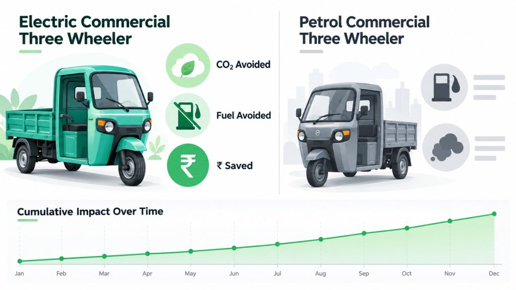
The Sustainability and Impact panel converts the same telemetry into numbers that management, lenders, customers and ESG teams care about. Two sets of toggles control it. The first switches between Lifetime and This Month. The second sets the comparison fuel: Petrol, Diesel or CNG. That second toggle matters in India, where the realistic alternative to an electric three wheeler might be a CNG vehicle in one city and a diesel vehicle in another.
In our example, with lifetime selected and petrol as the comparison, the panel shows:
| Tile | Example value | What it means |
|---|---|---|
| CO2 avoided | 0.46 tonnes over lifetime | Tailpipe emissions the equivalent petrol vehicle would have produced over the same distance |
| Distance covered | 6,105.0 km | Total tracked distance used as the basis for the comparison |
| Per km | 76 g | CO2 avoided per kilometre driven |
| Fuel avoided | 203.5 L | Petrol the comparison vehicle would have burned |
| Fuel cost saved | Rs 21,917 | The value of that fuel at the configured fuel price |
| Trips logged | 5,250 | Trips included in the calculation |
The numbers hang together: 0.46 tonnes over 6,105 km works out to about 76 grams per kilometre, and 203.5 litres over the same distance implies a comparison vehicle averaging about 30 km per litre, a realistic figure for a small petrol three wheeler. The panel also shows average efficiency, net cost per km, and charge time across all recorded charging sessions, so the environmental case and the operating cost case sit side by side.
The Cumulative CO2 avoided chart plots the running total month by month across a rolling twelve months. A flat line in the early months followed by a steady climb shows exactly when the vehicle began accumulating tracked distance, and the slope of the climb shows how hard the vehicle is working. A flattening curve on an asset that should be earning is an early utilisation warning.
As the panel itself states, impact figures are calculated using default fleet business assumptions for the EV versus ICE comparison, and those assumptions can be adjusted to your fuel prices and reference vehicles. We encourage every customer to set them deliberately, because a sustainability number is only as credible as the assumptions behind it. For the wider picture of where electric mobility in India stands this year, read our State of EV Mobility in India 2026 report.
12. Who Uses Which Part of the Dashboard
The same vehicle page serves very different people, and each of them reads it from a different corner. Designing one screen for all of them is what lets battery data move smoothly between an operator, a lender, an OEM and a future buyer without being re entered or reinterpreted along the way.
Fleet operators
Operators live in the top half of the page and the alert panel. They need to know which vehicles are ready for today’s routes, which need charging, which are due for a full charge, and which are showing early signs of trouble. Range remaining, cell alerts, temperature behaviour and mileage history translate directly into fewer stranded vehicles, fewer surprise workshop visits and better driver coaching.
NBFCs and lenders
For a lender, the battery is the collateral inside the collateral. The Battery Health card, cell history and charge cycle record show whether the asset is holding its value across the loan tenure. The Location card and Relay control support recovery when it is genuinely needed, and Ext Push sends daily aggregates and events straight into the loan management system. Before a loan is even approved, battery condition data can inform the decision, as we explain in why NBFCs need an EV battery health score before disbursement.
EV OEMs and battery partners
OEMs and battery makers look at the cell grid, thermal history and charging behaviour to understand how their packs perform in real Indian conditions, and to separate genuine manufacturing defects from abuse when a warranty claim arrives. A pack that failed after months of repeated deep discharge and hot charging is a very different claim from one that failed under careful use, and the history makes that difference visible.
White label partners
The Branding, Distributors, Sales, Orders and Districts modules exist because many of our customers run the platform under their own name. The dashboard in this article is itself running under a partner’s branding. A white label partner gets the full battery, cell, GPS and alert stack, presented as their own product, with their own distributor network and their own customer hierarchy.
Used EV buyers, dealers and resale platforms
When a vehicle leaves its first owner, the continuous battery record becomes its passport. Today most used EVs in India change hands with no verified battery data at all, which is a big part of why used EV prices in India have no standard. A vehicle that carries its SoH trend, charge cycle history and cell level data into the sale can be priced on evidence rather than guesswork. For vehicles without a telematics history, the Navionyx EV battery health certification process provides an independent assessment, and you can see what that looks like in our sample EV battery health report.

13. A Five Minute Daily Routine for Fleet Managers
A dashboard is only as useful as the habit built around it. This is the routine we recommend to fleet managers when they first go live on Navionyx. It takes about five minutes each morning for a fleet of a few dozen vehicles, and far less once the alert rules are tuned.
1 · CHECK WHO IS REPORTING
Start with the fleet list and look for vehicles that are offline or have not updated recently. Stale data hides every other problem.
2 · CLEAR THE ALERTS
Review new alerts, starting with cell level and thermal alerts, then charging not started, then location and usage alerts. Assign each one an owner.
3 · MATCH CHARGE TO ROUTES
Compare each vehicle’s range remaining against its planned route for the day, and move vehicles or schedule top ups before dispatch rather than after a breakdown.
4 · SCAN FOR CELL AND HEAT OUTLIERS
Sort by cell spread and hottest cell. The vehicles at the top of those lists are your predictive maintenance candidates.
5 · WATCH MILEAGE
Look for vehicles whose km/kWh has dropped against their own recent average on a similar route, and check driving behaviour for the same period.
Once a week, add two more checks: a review of State of Health trends across the fleet, and a list of vehicles whose last full charge is older than your chosen interval. Once a month, export the sustainability figures for your management and lender reporting.
14. Frequently Asked Questions
What is an EV dashboard?
An EV dashboard is a software view that combines live vehicle location with data read from the vehicle’s Battery Management System, including state of charge, state of health, cell voltages, temperatures, charging sessions and alerts. Unlike a basic GPS tracker, it explains the condition of the battery as well as the position of the vehicle.
How is State of Charge different from State of Health?
State of Charge is how full the battery is right now, like a fuel level. State of Health is how much of the battery’s original capacity remains, like the condition of the fuel tank itself. SoC changes every minute. SoH changes slowly over months and years, and its trend is what determines the battery’s remaining useful life.
Why monitor individual cells if the BMS already protects the pack?
The BMS protects the pack in the moment by stopping charge or discharge when a cell reaches its limit. It does not tell the fleet owner that one cell has been drifting for six weeks, or which cell is limiting the whole pack. Cell level history turns protection events into early warnings and targeted repairs.
What does “Balanced” mean on the cell panel?
It means the voltage spread between the highest and lowest cell is within the healthy threshold configured for that pack. In our example, the spread is 10 mV across sixteen cells, which is a well balanced pack at rest.
Do we need separate devices for GPS tracking and battery monitoring?
No. A single Navionyx device connects to the vehicle’s CAN bus to read BMS data and also provides GPS positioning, so location, battery and alert data share one timeline and one installation.
Can this data flow into our own loan management system or ERP?
Yes. The Ext Push module and APIs send alerts and daily vehicle aggregates, such as distance, charging cycles, battery health and geofence events, to external systems using signed payloads that the receiving system can verify.
Which vehicles are supported?
Navionyx hardware works with the major electric two wheeler, three wheeler and commercial EV platforms operating in India, including electric rickshaws and L3 category vehicles. Compatibility for a specific model can be confirmed during onboarding.
Conclusion: One Screen, Every Question That Matters
A modern EV dashboard has to do much more than place a pin on a map. It has to tell you what the vehicle can do today, what the pack can do over the coming years, which of its sixteen cells is starting to struggle, where the energy went, what needs attention before it fails, and what all of it is worth in fuel, carbon and rupees. The Navionyx EV dashboard brings those answers onto one screen, built on one continuous stream of BMS and GPS data, so that operators, lenders, OEMs and future buyers are all reading the same truth about the same battery.
The most important habit is to read the relationships, not just the numbers. When pack voltage agrees with the cells, when state of charge agrees with amp hours, and when energy agrees with distance, you can trust what you see. When those relationships start to drift, the dashboard has already given you your earliest warning.
See your own fleet on the Navionyx EV dashboard
Get a live walkthrough using your vehicle types and routes: battery health, cell level data, GPS history, alerts and predictive maintenance in one platform.
Book a Live Demo →Screens shown in this article are from a live Navionyx deployment, captured on 30 September 2026, with vehicle and device identifiers masked. Rules of thumb and worked examples are illustrative; always confirm thresholds with your vehicle and battery OEM.
Sources: FY2026 EV registration figures are based on Vahan retail registration data from the Ministry of Road Transport and Highways. Temperature and ageing observations draw on published, peer reviewed lithium ion degradation research.
This article was researched and written with AI assistance and reviewed by the Navionyx team.